


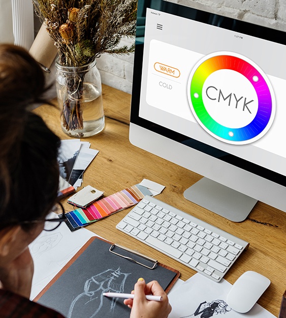
The reasoning behind this is that colors are mixed differently for the screen/display, as well as being mixed differently for print. The way both screen and print mix colors rely on two important models.
When it comes to working on a graphic design related assignment, the journey to inception to completion can be very long and sometimes, it can be a challenging one as well. We speak to our clients about what the project might entail. We ask many questions to make sure you are getting every detail necessary to fulfill our client’s wishes. Let us provide you with a quick scenario to bring more perspective about the topic we are going to discuss one that many clients have experienced.
Yourself (the client) and the designer, agree that creating brochures to promote the event planning business will be the best resort. You discuss the copy, the type of typography, the specific types of illustrations, as well as the colors that will best able to show the brochure in the best way possible. You expect that your designer works hard in fulfilling your wishes. Drafts are sent electronically, (for convenience), you both seem very pleased with the colors used. You and your designer meet with the printed versions of the brochure. You look very attentively to the brochure. Meanwhile, your designer sees the concern in your eyes. They get a little flutter in their chest and starts questioning them self. What did I do wrong? Did my client not like the font? Was the content not up to par? Are the illustrations to big? Too small? Finally, the answer the designer has been waiting as to why you are looking so attentively with hints of worry presents itself. You ask “Why do the colors on this brochure do not match to the ones you have sent me electronically? I thought those were the colors that we have agreed on?”
And you have agreed on those colors. Luckily, (we hope), your designer knows what to say to you about the reasoning behind the color differences between the printed version and the electronic (web) version of the brochure. The reasoning behind this is that colors are mixed differently for the screen/display, as well as being mixed differently for print. The way both screen and print mix colors rely on two important models. For display, the RGB model is used. For print, the CMYK model is used. Let us explain the mechanics of these two models.
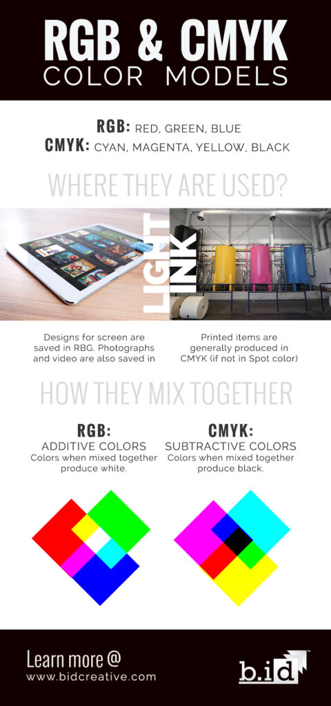
The RGB Color Model System
Graphic design assignments begin the production stage through electronic means, the standard today, and use the RGB color model to display colors. RGB stands for red, green and blue. These are the primary colors used to make all possible color combinations using light. Millions of colors can be shown through light through a limited amount of resolution.
The RGB color system coincides with another model called the additive color system, in which the RGB colors are activated with the use of light to devices that contain black screens or backgrounds like computers. They essentially bring color to blank canvas, and in this circumstance, the canvas is the black screen in electronic devices. You are essentially adding colors, hence the name additive. Because the RGB model uses light to display color, which makes the possibility of creating millions of colors, you will see that colors will be pronounced, and have a stronger definition.
The CMYK Color Model System
The other way color is produced is the CMYK color model system. CMYK stands for Cyan, Magenta, Yellow, and Black. Used by printers (think of the four ink/toner cartridges you have), designers are required to submit designs meant for print using this model to ensure colors are interpreted accurately. The most significant difference in our opinion is the CMYK model uses ink to be able to produce multiple colors from the four base colors of this system; additionally, there must be a higher resolution to efficiently and accurately print projects with their corresponding colors. The CMYK system is based on the subtractive model system. Unlike the RGB color model system, where the light was added to create color when creating material, color subtracts from the combination of the four base tones of this system, where the white paper used absorbs the remaining colors. This will make colors look darker or more muted, therefore creating a slight difference in the way colors appear on the RGB and CMYK model systems.
Even though these models have their differences, the colors that are being provided by these models are the same. The difference solely relies on how these models mix their colors, and how these models obtain color. The minimal difference in tone when printing your design project depends on what materials are used in these two models. The RGB color model uses light. The CMYK color model uses ink. The designer should explain to you that the colors you see in a printed brochure and the colors you see on the electronic proofs are the same. The proofs that you have seen electronically are different because you are seeing them through the RGB color model system.
Remember, when it comes to seeing any design work through electronic means, you will be seeing them through the RGB color system because that is the system that electronics use when displaying color. In order to see the design project in its expected way, which in this case is the CMYK color model, we suggest you do a test print of the project that we have sent to you electronically. The colors on the screen and the printed material are the same; the difference is that you see in the colors are based on different sources of color, light versus ink and they way your eye interprets them.
More articles you may like

Category: b.iD on Branding
Logos To Be Green With Envy Over

Category: b.iD on Color
Red Hot Logos (& the brands that Love them)
Category: b.iD on Color
The Logo Blues
Category: b.iD on Color
The Message Behind Color
Copyright © 2014-2024 b.iD LLC. All Rights Reserved.
Boutique Creative Agency providing Branding Specialists, Logo, Copywriting, Print & Web Designs, Public Relations, and Marketing solutions in Houston, Texas