


Green is a process, not a status. We need to think of 'green' as a verb, not an adjective.
Daniel Goleman
What do Land Rover and Whole Foods Market have in common? What about Starbucks Coffee and Spotify? Besides being large organizations that cater to consumers’ needs, they also have something else in common. Their logos feature the color green. In this blog, we will explain why these brands, among others, decided to embrace this spectacular color. The reasoning for brands to incorporate green into their respective logo designs can be explained through the power of psychology, the science of the mind, and the behavior that all humans exhibit. At b.iD, we value and acknowledge the influence that color has on design. We believe that design plays an integral role in the representation of any brand. Such belief is part of our DNA – and our name. We love color, and we understand its importance. Most of all, we understand some of the strategic decisions that are made behind the scenes to create the right designs, including incorporating the correct colors to highlight brands in the best way possible.
Below you will discover why some of the most respected brands in the world decided to utilize green as their most principal color within their respective logos.
Energy
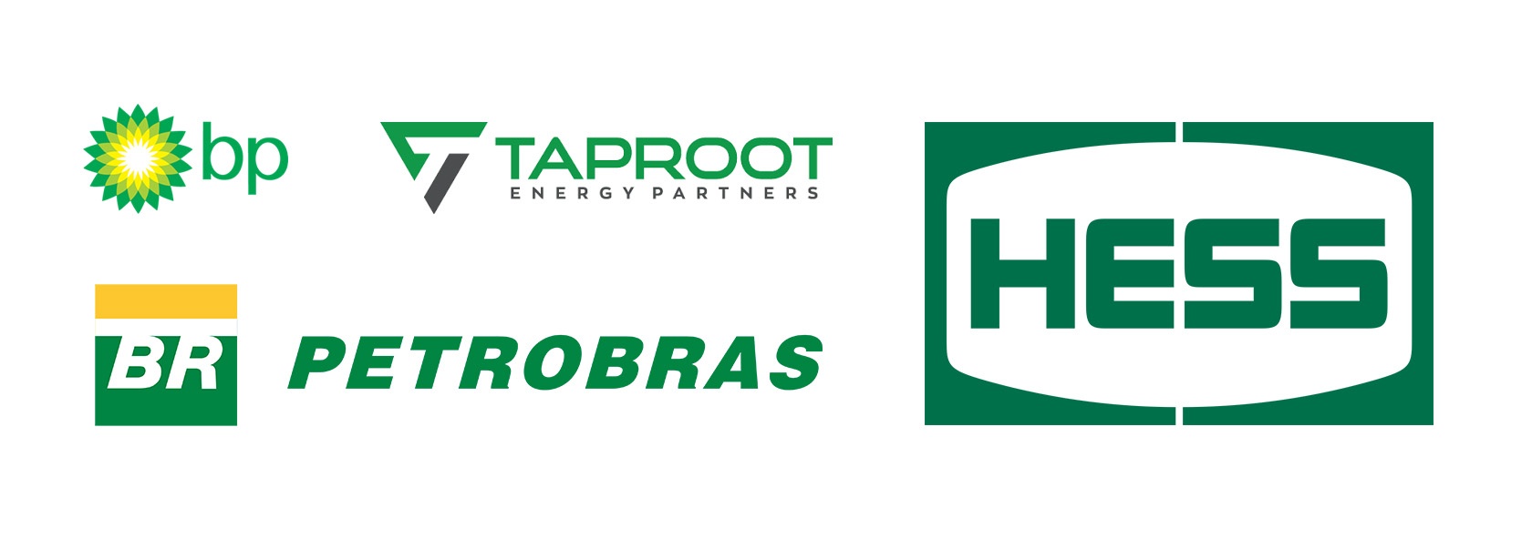
Green is the perfect color to symbolize the environment. In today’s age, discussions about how to protect our environment have increased tenfold, which comes to us as no surprise. The most prominent scientists and experts have sounded the alarm regarding global warming and the detrimental effects it may bring to the environment. Thankfully, there are corporations and similar organizations that are doing their part in preventing this from occurring. Take BP (British Petroleum), for example. BP’s logo consists of yellow and green tones that reflect the importance of the environment. The oil and gas giant has made efforts to help the environment obtain the protections it needs to thrive in the future. How so? Well, the oil and gas giant has divisions in renewable energy, which include wind power and solar technologies, which are environmentally friendly options that promote the value of sustainability. Other major energy companies are doing their part in helping nature recover and promote the necessity for sustainability for the purpose of strengthening the environment. We owe it to our future generations to thrive in a healthy environment. Other energy companies that include green in their logo design include Petrobras, an international organization within the petroleum industry.
Technology
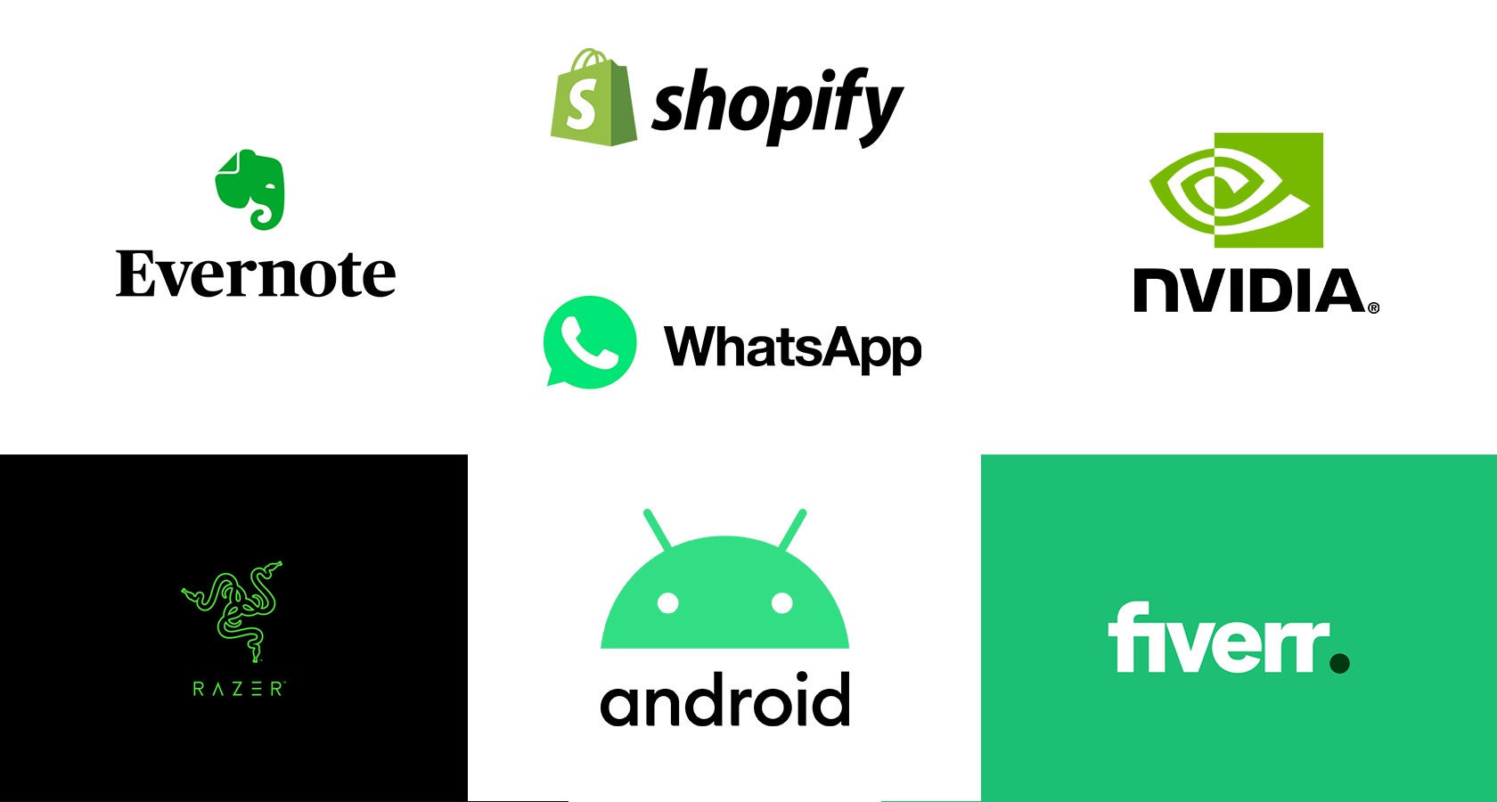
Because green is usually associated with money, there are brands that take advantage of this notion. Take, for example, the Grab app for the Southeast Asia market. This app helps consumers find taxis, drivers, and other transportation means to safely get to their destination. What’s so advantageous about this app is its cost-effectiveness, which helps users save money. This helps consumers that have multiple destinations in mind. Green is also a color that represents trust. Consumers spend hundreds if not thousands of dollars in technology to help with everyday tasks, including work responsibilities. Acer, the Tawainasese electronics corporation, utilizes green throughout their logo to exude trustworthiness. Whatsapp, a popular messaging application, utilizes green to promote security, which is basically another way of symbolizing trust. Apps such as Whatsapp and Grab understand that users take into consideration safety and reliability. Corporations and other businesses alike understand that utilizing colors that promote trust can make all the difference and ultimately help consumers obtain peace of mind when navigating through software, electronics, or other technology.
Financial and Banking
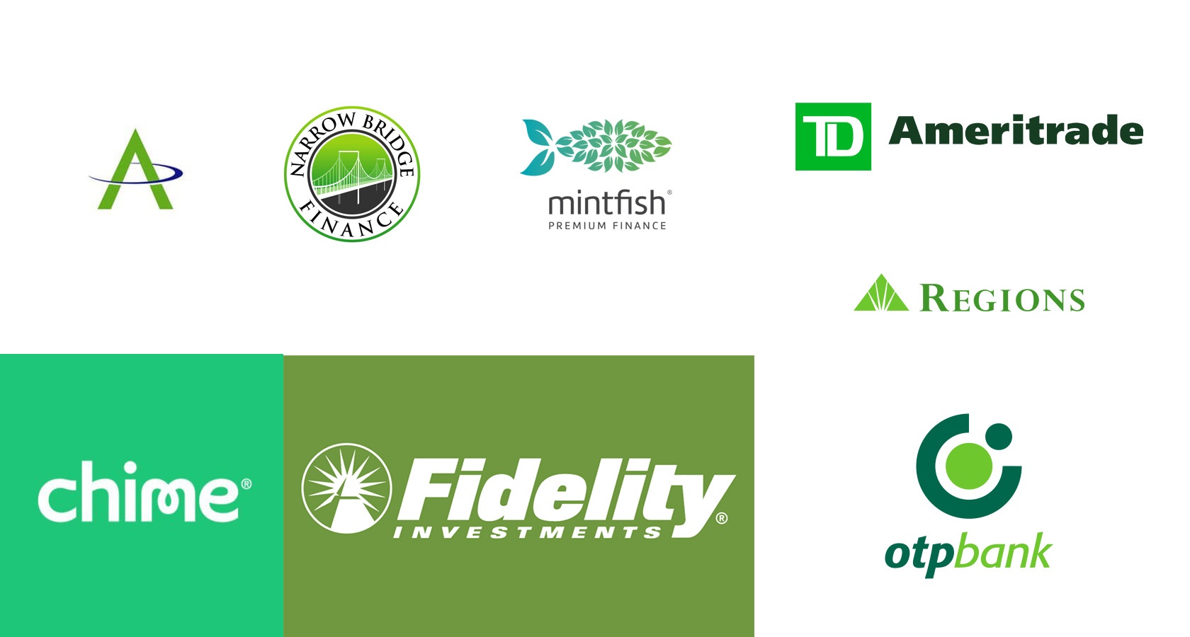
Name a person that doesn’t want any more financial freedom and prosperity. Such persons hardly exist. Green is synonymous with money, and it is certainly not surprising when some of the most prominent financial institutions utilize green in their logo designs. Besides representing money, green also symbolizes growth, which is necessary for many people to live a prosperous life. Growth in terms of financial gain is a goal for most individuals and organizations that cater to this specific need work arduously to provide their consumers just that. Fidelity Investments is an organization that incorporates the color through its logo and other visual components. Fidelity provides financial opportunities to consumers through retirement accounts and other investments to secure economic growth. The company’s logo designs prove that. Other financial organizations that utilize green to promote financial growth include TD Ameritrade and Regions Financial Corporation.
Media and Entertainment
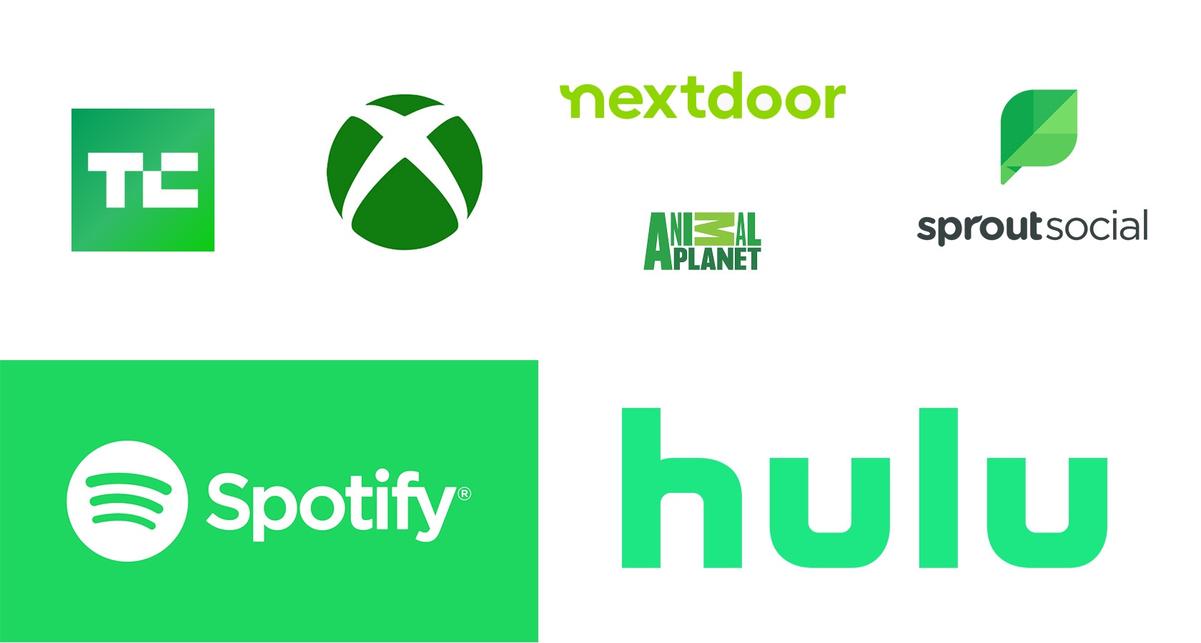
Green is a color that dominates our surroundings, especially when it comes to nature and our environment. Therefore, companies use green to grab audiences’ attention and captivate them by strategically using contrasting colors. Take Spotify, for example. The streaming services provider uses a much darker color to contrast with the light green tone utilized in their logos. Another streaming media giant that incorporates green to captivate audiences is Hulu. What a better way to grab the attention of prospective viewers than by utilizing a neon-like green. Xbox, the video gaming console by Microsoft, also utilizes techniques similar to Hulu and Spotify, using bright, captivating green tones and contrasting them with darker palettes. Even fictional characters such as the Green Lantern understand the power of green. The creators specifically use green to showcase the superhero’s determination and strength, symbols of vitality. Green is mostly associated with vitality.
Academics
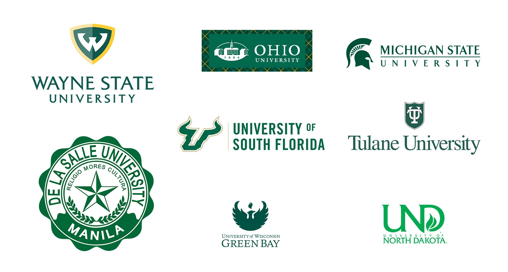
For those individuals seeking continuous financial growth, or at least gain some financial security, believe that having an education may help them reach such goals. For those seeking a degree from a college or university, individuals go through various lengths to decide which institution is right for them. Individuals have varied needs and must consider various factors to decide which institution is right for them. Colleges know this very well. They spend millions a dollars a year on advertising alone to attract the best and brightest. Green stands for growth and prosperity, and students are seeking just that. Some colleges incorporate green on their logos to refer to their communities. The University of Oregon in Eugene is surrounded by a lush green scenery that is almost enviable, so perhaps the usage of green throughout the university’s logo can be explained. Still, it is wise to consider that for universities seeking a way to rebrand or reinvigorate their logo designs, going green is certainly the way to go. Other academic institutions that utilize green in their logo designs include the University of North Texas and Dartmouth University.
Food and Beverage
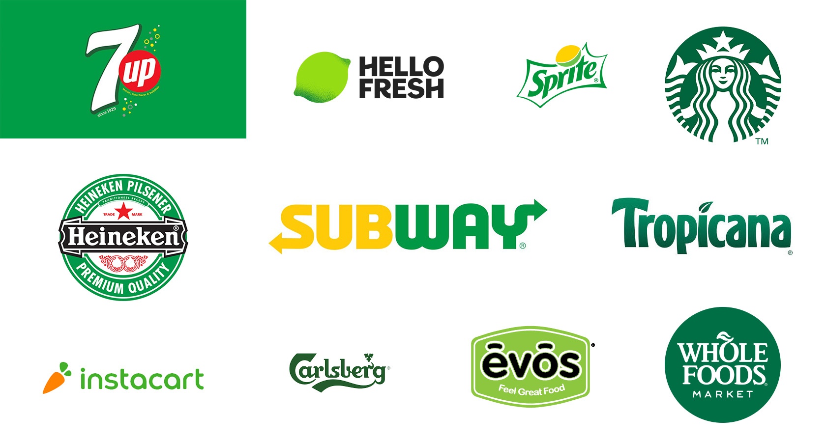
Compared to other wealthy nations, the U.S. has one of the highest obesity rates, which highlights the need for companies to promote a healthier lifestyle for Americans. One of the best ways to create a subtle yet impactful message to reach consumers is by using green in logos. Green stands for health, vitality, and the all-natural; therefore, some brands promote a healthy lifestyle and use green because of its proximity to nature, the environment, and health. The fast-food restaurant, Subway, uses greens throughout its logo to remind consumers of its freshness and the healthy options it provides for those seeking to improve their lives. Whole Foods Market, the supermarket chain that promotes the most organic selections for consumers, also utilizes green throughout its logo. Finally, Tropicana, a company that specializes in producing beverages, utilizes green to promote their healthy options, including 100 percent orange juice, a beverage filled with health benefits that fortify the immune system. Want to inspire others to get healthy? The answer lies in the color green.
Hospitality
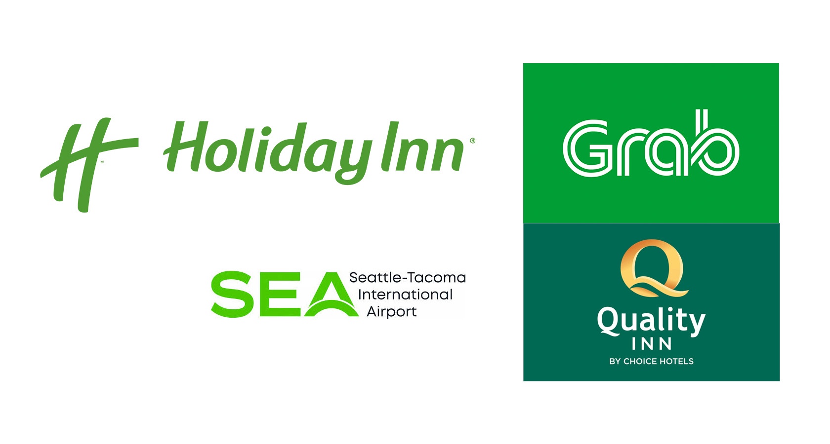
As mentioned before, Green stands for the environment, as well as growth. But did you also know that this captivating color also stands for tranquility, safety, and healing? The hospitality industry prides itself on providing just that; comfort, tranquility, and healing. For those who are tired and want to receive a good night’s rest, the hospitality industry is there to help. For those seeking an escape and getting energized through a long and peaceful vacation, for example, the hospitality industry is available to meet this particular demand. The year 2020 brought with it a lot of obstacles for many, which has caused significant stress. A way to regain tranquility, calm, and peace is by enjoying what individuals love the most, which includes spending quality time with friends and family, or in many cases, just by themselves. A good way to unwind is through the support of outstanding establishments, like the renowned Hilton Hotels. Hilton, the international hospitality company, utilizes green in their logos to promote healing, where hotel goers can relax and unwind. Other hospitality companies that use green in their logos include Quality Inn by Choice Hotels International.
Add a Little Green in Your Life
Are you a business owner thinking about what color scheme to use for your logo or any other visual design for your brand. Do you believe incorporating green is the right choice for your graphic design needs? Perhaps you have other colors in mind? At b.iD, we are here to guide you in choosing the right color scheme to secure maximum visibility for your business. We’ll help you get started.
More articles you may like

Category: b.iD on Branding
The Indestructible Core: How Values Validate Your Brand’s Worth

Category: b.iD on Branding
From Fuzzy to Focused: A Guide to Achieving Brand Clarity

Category: b.iD on Branding
Marketing on a Budget

Category: b.iD on Branding
Vision Without Voice is Directionless
Copyright © 2014-2024 b.iD LLC. All Rights Reserved.
Boutique Creative Agency providing Branding Specialists, Logo, Copywriting, Print & Web Designs, Public Relations, and Marketing solutions in Houston, Texas