


Understanding the fundamental aspects of graphic design is a task that most professionals within this field are required to retain in order to successfully execute any creative-based project. Because many have had a significant amount of experience knowing and understanding such concepts, it comes naturally to these professionals to speak freely about graphic design with a considerable amount of confidence. Although they have this vast amount of knowledge and experience, they all started from the beginning. They all sat through various courses or had mentors that were able to teach them the fundamentals of graphic design. Many communication professionals, or individuals who would like to learn more about design, did not have such experience. Well, you no longer have to worry about that. We are here to provide you with a glossary of terms that will help non-designers understand basic but important elements of graphic design.
Below is the first group (A-L) of graphic design terms and concepts.
A
Above the fold: it is a term that refers to having the most important content visible to a viewer or reader without the need of turning a page (print work) or scrolling down (web work).
Analogous: color scheme that was created from three different colors. These colors are next to each other on the color wheel.
Alignment: desired balance, positioning, alignment of text and/or images. The most recognizable forms of alignment are center, right, left and justified
Animation: images that move rapidly in a sequence that create the illusion of movement.
Artwork: images, photographs, graphics, typography and other works that were created with extraordinary ability that are usually seen on a variety of publications.
Asymmetrical: graphic or text that is not identical on both sides of a central line.
B
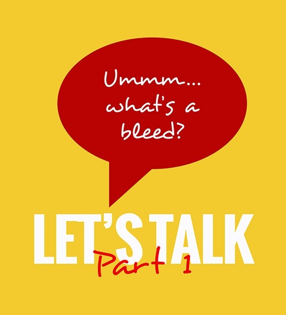
“Ummmm….what’s a bleed and why do I need one?”
Bleed: additional coloration that is meant to reach the edge of page, removing the possibility of having white lines on edges when material is printed and cut.
Brochure: a small booklet or magazine that is usually folded that contains images, graphics, and textual information regarding an organization’s product or service.
Busy: design that may be considered visually overwhelming to a viewer due to lack of balance and structure.
C
“I thought you said you updated the site? I’m still seeing the old stuff.”
Cache: information that was stored when an individual wrote or submitted information on a website.
CMYK: it is an abbreviation of a color model that is used in printing. It stands for Cyan, Magenta, Yellow and Black.
Contrast: the difference and arrangement between two elements that are traditionally opposite, such as light and dark, thick and thin, and large and small.
Complementary Colors: these are colors that are opposite of each other on the color wheel.
Comp: it is short for comprehensive, which is a draft of a design that is presented to a client that shows how the images and other elements will look like before printing.
Copy aka body copy: written material that is incorporated in a design, website, magazine or any other publication for the purpose of selling or informing.
CSS: short for cascading style sheets. It is a code that describes how HTML components will be displayed on a website.
D
“Okay and I need it like yesterday?”
Deadline: refers to the latest time and date that a project must be turned in. (Preferably a date in the future.)
Dye-Sublimation: a printing method that uses heat to transfer dyes onto fabrics, plastics, ceramics, and other materials.
E
Emboss: technique that is used to give an image or text a three-dimensional appearance by using highlights and shadows.
EPS: short for encapsulated postscript. It refers to a file format that contains images, (raster and vector images), that be edited in various programs.
F
Feathering: it refers to a technique used in graphic design to soften the edges of an image in order for it to appear smoother.
“Can we just add….?”
(Feature) Creep: the constant addition of features or elements to a project that were not originally discussed, which can overwhelm a designer.
Filter: a visual effect tool that is created to alter the appearance of an existing image.
Flattening: the combination of multiple layers of a design that are condensed to one layer.
Fluid Layout: the design of a website that allows for the modification of contents when a window size is altered.
Foil Stamping: a technique that adds foil onto a surface through the use of heat, which provides the material or surface with a shiny metallic finish.
Font: the combination of characters, such as letters and numbers, that is designed in a particular form and style.
Fold: in terms of web design, it refers to the lowest visible position or point within a website.
Four-Color Process (see CMYK): printing that is done by combining the colors Cyan, Magenta, Yellow and Black.
Frame rate: the number of frames (graphic images) that are displayed per second.
“F-T-Who??”
FTP: short for file transfer protocol. It refers to a safe way to share files between multiple entities in the web.
G
Gatefold: paper that is folded inwards in order to produce four or more panels.
GIF: short for graphics interchange format. It is an animated image that has movement.
Gradient: refers to gradual change or transition of colors.
Grayscale: images that are only presented in black, white or multiple shades of grey.
Guerilla: refers to designs that are created in non-traditional or unconventional ways.
GUI: short for graphical user interface. It is a website or an app that is based more on graphics than text.
H
Halftone: an image that has been reproduced into dots through a graphic design technique. The purpose of the dots is to mimic shading.
Hamburger: it is an icon on a website that comes in the form of three horizontal lines that is usually found on the top right or left corner of a page. It is a symbol for a website’s menu.
Hard copy: text, images or designs or any form of content that is printed.
Hierarchy: the arrangement of design elements that are ranked based on the level of importance.
“Is this High-Res?”
High- Resolution Image: an image that is of phenomenal quality and clarity. High-resolution images present themselves with superior detail. They are typically 300 dpi or higher.
Hue: hues are all the colors that make up the color wheel. They include primary, secondary and tertiary colors.
I
Indent: moving away from the principal margin in order to start a new line of text.
Infographic: information presented that incorporates specialized typography, images, designs, and charts for better understanding.
Inkjet Printer: a printer that sprays tiny ink dots on paper in order to produce various forms of materials such as copy and photography.
Italic: it is a text style that is used for emphasis. The lettering of this style leans to the right.
J
JPG/JPEG: this term stands for joint photographic electronic group. It is a method that compresses digital images, such as photography.
K
Keyframe: a specifically defined frame that facilitates a transition.
KPI: short for key performance indicator. It is a measure that indicates whether or not a business is achieving objectives.
L
Laser Printer: a printer that uses a laser that is directed towards a drum that helps create electrical charges that activate toner. After this sequence, the toner will then transfer to paper.
Layer: it is a tool that helps users organize and edit elements of design.
Legibility: the level of which a user can decipher or identify a text or an image.
Letterpress: a technique that uses raised surfaces with ink, that is then pressed on paper.
Logotype: aka a “Word Mark is basically a brand name that is styled as a logo. For example, Google’s and Facebook logos are logotypes.
“What’s this Greek stuff in the design?”
Lorem Ipsum: filler text that is used in many layouts when the correct text has not been completed yet.
Low-Resolution Image: an image that is low in quality and clarity. A low-quality image is less than 72 dpi.
More articles you may like
Category: b.iD on Business
What can my fCBO do?
Category: b.iD on Marketing
Mission-Driven Marketing: How to Authentically Promote Your Nonprofit’s Work

Category: b.iD on Business
Focusing on ROI is Killing Your Brand
Category: b.iD on Branding
Marketing on a Budget
Copyright © 2014-2024 b.iD LLC. All Rights Reserved.
Boutique Creative Agency providing Branding Specialists, Logo, Copywriting, Print & Web Designs, Public Relations, and Marketing solutions in Houston, Texas